Have you ever bought a piece of clothing in a store that looked like a vibrant golden yellow, only to get it home and realize it looks more like a dull mustard? Or perhaps you’ve noticed that food looks delicious under a restaurant’s warm glow but unappetizing under the harsh lights of an office?
The reason for this phenomenon isn't a change in the object itself, but a change in the Color Rendering Index (CRI) of the light source.
What Exactly is CRI?
In simple terms, Color Rendering Index (CRI) is a quantitative measure of a light source's ability to reveal the colors of various objects faithfully in comparison with a natural or ideal light source.
It is measured on a scale from 0 to 100. The higher the CRI, the better the light source can "render" or show the true colors of people, furniture, and food.
-
CRI 100: This represents natural sunlight or an incandescent bulb. Under these lights, colors appear exactly as they should—100% accurate.
-
CRI 0: At the bottom of the scale, colors are impossible to distinguish, much like seeing objects under a low-pressure sodium street lamp where everything looks monochromatic yellow or grey.
The Core Concept: Accuracy vs. Brightness
One of the most common misconceptions for beginners is that a "High CRI" bulb is a "Brighter" bulb. This is incorrect.
-
Brightness (Lumens) is how much light is being pumped out.
-
CRI is the quality of that light.
A bulb can be incredibly bright but have a low CRI, making your surroundings look washed out or "sickly." Conversely, a dim light with a high CRI can make colors look deep, rich, and natural. Understanding CRI is the first step toward moving away from "just lighting up a room" and toward quality lighting design.
Understanding the Basics – How is CRI Calculated?
To understand why one light bulb is rated at 80 and another at 95, we have to look at the science behind the measurement. CRI isn't just an arbitrary guess; it is the result of a rigorous mathematical comparison.
The Reference Source: The "Perfect" Standard
CRI is calculated by comparing a test light source against a reference source.
-
If the color temperature of the light is below 5000K (warm light), it is compared to a Black Body Radiator (like an incandescent filament).
-
If it is above 5000K (cool light), it is compared to Natural Daylight.
Both of these reference sources are considered to have a CRI of 100, as they contain a full, continuous spectrum of light that reveals all colors perfectly.
The 8 Standard Colors (R1–R8)
When a lighting manufacturer tests a lamp, they shine the light onto a set of standardized color swatches. The original CRI system uses eight standard color samples (labeled R1 through R8).
These are mostly "unshaded" or pastel-like colors, such as light grayish-red, yellowish-green, and light reddish-purple. The "General CRI" score—often referred to as Ra—is simply the mathematical average of these first eight values.
What is Ra?
On a spec sheet, when you see "CRI 80," you are looking at the Ra value.
-
A score of Ra 80 means that, on average, the light shifted the appearance of those eight pastel colors by 20% compared to natural light.
-
A score of Ra 95 means the shift was only 5%, which is nearly imperceptible to the human eye.
While the 8-color system has been the industry standard for decades, it has a significant blind spot: it doesn't account for deep, saturated colors. This is where we must look deeper into the "Extended CRI" values, which we will discuss in the next sections.
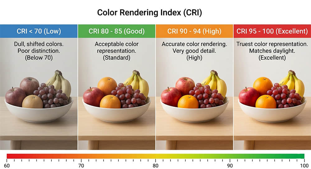
CRI 80 vs. CRI 90 vs. CRI 95 – Which One Should You Choose?
Choosing the right CRI value is a balance between visual quality and project requirements. While it might seem logical to always aim for 100, the industry generally categorizes performance into three tiers. Understanding these tiers helps you decide where high color accuracy is mandatory and where "standard" lighting is sufficient.
CRI 80: The "Standard" Choice
CRI 80 is the baseline for most commercial and industrial LED lighting. At this level, colors are balanced enough for basic tasks, but they lack "pop" or vibrancy.
-
Visual Effect: Colors appear slightly muted. Deep reds may look somewhat brown or greyish.
-
Best For: Warehouses, parking garages, corridors, and general office spaces where color critical tasks are not performed.
-
Why use it?: It is the most cost-effective option and widely available.
CRI 90: The "Ideal" Standard for Living
In the last few years, CRI 90 has become the new benchmark for high-quality residential and hospitality lighting. It is often referred to as "High CRI."
-
Visual Effect: Colors look rich and natural. Wood grains appear deeper, and fabrics look more like they do under sunlight.
-
Best For: Living rooms, bedrooms, high-end offices, and restaurants. It makes the environment feel more comfortable and "warm."
-
The "90 Rule": For any space where people spend significant time or where food is served, CRI 90 is highly recommended.
CRI 95+: The "Professional" Choice
This is the elite tier of lighting, often reserved for specialized applications where color precision is non-negotiable.
-
Visual Effect: Colors are rendered with near-perfect fidelity. The difference between 90 and 95 is subtle to the untrained eye but critical for professionals.
-
Best For: Art galleries, museums, jewelry stores, photography studios, and surgical suites.
-
Why use it?: When the goal is to showcase a product or a piece of art exactly as the creator intended, CRI 95+ is the only option.
| CRI Value | Quality Level | Best Application |
| Below 70 | Poor | Street lighting, basic security lighting. |
| 80 - 85 | Standard | Warehouses, storage rooms, office hallways. |
| 90 - 94 | High Quality | Homes, hotels, retail stores, dining areas. |
| 95 - 100 | Professional | Museums, clinics, fashion boutiques, studios. |
The Law of Diminishing Returns
It is important to note that the human eye is more sensitive to the jump from CRI 80 to CRI 90 than it is from CRI 90 to CRI 95. For a standard home renovation, moving to CRI 90 provides a massive visual upgrade. Moving to 95 is a luxury choice that offers a more refined, professional finish.
The "Hidden" Secret – Why R9 (Saturated Red) is Critical
Have you ever stood under a "High CRI" light and noticed that your skin looked pale, or a fresh steak in a grocery store looked strangely grey? This happens because of a missing link in the standard CRI calculation: R9.
Beyond the Average (Ra)
As discussed earlier, the standard CRI (Ra) is only an average of the first eight pastel colors (R1–R8). However, the full CRI system actually includes 15 color samples. Among these, R9 through R12 represent saturated, vivid colors that are much harder for LEDs to reproduce accurately.
-
R9: Saturated Red
-
R10: Saturated Yellow
-
R11: Saturated Green
-
R12: Saturated Blue
Why R9 is the Most Important "Extra" Value
Of these saturated colors, R9 (Red) is the most critical for human environments. Because red is a primary component in many things we care about—human skin tones, wood flooring, red wine, meat, and flowers—a low R9 score can make a space feel "dead" or "clinical."
-
Skin Tones: Healthy skin has red undertones. Without R9, people look tired or sickly.
-
Food & Retail: In a grocery store or restaurant, R9 makes produce look fresh and meat look appetizing.
-
Home Decor: High-end cherry or mahogany furniture requires R9 to bring out the warmth of the wood grain.
What to Look For on a Spec Sheet
Standard LEDs often have an R9 value of 0 or even a negative number, even if their Ra is 80. When you are selecting lights for a premium project, look for a "Full Spectrum" LED.
The Pro Standard:
-
For Homes/Offices: Aim for Ra 90+ and R9 > 50.
-
For High-End Retail/Museums: Aim for Ra 95+ and R9 > 80.
By checking the R9 value specifically, you ensure that the "High CRI" claim on the box translates into a truly vibrant and healthy-looking environment.
CRI vs. CCT – Don’t Confuse Accuracy with Warmth
One of the most frequent mistakes people make when buying lights is confusing CRI with CCT (Correlated Color Temperature) . You might hear someone say, "I want a high CRI light, so I'll buy a 'Cool White' bulb." This is a misunderstanding of how light works.
To get the best lighting for your space, you must understand that these two metrics are completely independent of each other.
CCT: The "Mood" of the Light
CCT measures the color appearance of the light itself, not how it reflects off objects. It is measured in Kelvin (K).
-
Warm White (2700K – 3000K) : Yellowish, cozy light similar to a sunset or a candle.
-
Cool White (4000K – 5000K) : Neutral or bluish light similar to high noon or a hospital setting.
CRI: The "Resolution" of the Light
CRI measures the accuracy of the colors under that light.
-
A light can be Warm (3000K) and have a High CRI (95) —making your red sofa look rich and deep.
-
A light can be Cool (5000K) and have a Low CRI (70) —making everything look "bright" but making your skin look green or grey.
Professional Insights – Limitations and the Move to TM-30
While CRI has been the global standard for over 50 years, it is not without its flaws—especially as we move deeper into the LED era. Lighting designers and engineers are increasingly looking at more comprehensive metrics to get a fuller picture of light quality.
The Limitations of CRI
The biggest criticism of CRI is its simplicity. Because it only averages 8 to 15 color samples, it is possible for a manufacturer to "game the system." An LED can be engineered to hit those specific color points accurately—resulting in a high CRI score—while still failing to render other colors in the spectrum correctly. This can lead to a phenomenon where two bulbs with the same CRI score of 90 actually look very different to the human eye.
Introducing TM-30-18
To solve these issues, the Illuminating Engineering Society (IES) developed TM-30, a more advanced method for measuring color rendition. Instead of just 8 or 15 colors, TM-30 uses 99 color evaluation samples, ranging from common skin tones to the colors of nature and textiles.
TM-30 provides two key scores that tell a more complete story than CRI ever could:
-
Rf (Fidelity Index) : Similar to CRI, this measures how closely colors match the reference source (0–100).
-
Rg (Gamut Index) : This measures saturation. An Rg score above 100 means colors look more vivid or "popping" than natural light, while a score below 100 means colors look more dull.
What This Means for You
For most homeowners and general buyers, CRI is still the most useful and widely available metric. However, if you are working on a high-end architectural project or professional gallery, you should ask for the TM-30 report.
Ideally, for premium spaces, you want an Rf > 90 and an Rg between 95 and 105. This ensures that colors are not just accurate, but also have the right level of vibrancy.
How to Check CRI on Spec Sheets & Final Conclusion
Now that you understand why CRI matters, the final step is knowing how to find this information when you are ready to buy. Most consumer light bulb boxes will list the CRI on the back or side, but for professional projects, you need to look at the Technical Specification Sheet (often called a "Spec Sheet" or "Data Sheet").
Finding the Numbers
On a professional spec sheet, the CRI is usually listed under "Optical Characteristics" or "Photometric Data."
-
Look for "Ra" : This is the general CRI score.
-
Look for "R9" : As we discussed, this is often listed separately. If it’s not there, you may need to request the IES LM-79 Report from the manufacturer, which is a detailed test report showing the full spectral power distribution.
Buying Tip: The "CRI 80+" Trap
Be wary of products that only list "CRI 80+" or "CRI >80." This often means the manufacturer is only guaranteeing a minimum baseline, and the actual color quality may vary between batches. For projects where color is critical, always look for a specific, tested value (e.g., "CRI 92 typical").
Conclusion – Good Lighting Starts with Good Optics
The Color Rendering Index is more than just a technical specification; it is a measure of how we experience the world around us. In an era where we spend the majority of our time under artificial light, the quality of that light directly impacts our mood, our productivity, and our appreciation of beauty.
Remember the "90/80/70" Rule:
-
CRI 90+: Essential for any space where people live, eat, or socialize.
-
CRI 80+: Sufficient for offices, hallways, and general utility tasks.
-
CRI 70+: Only acceptable for outdoor safety or industrial areas where color recognition is secondary to visibility.
By prioritizing high CRI and checking for a healthy R9 score, you ensure that your lighting does more than just banish the darkness—it brings your environment to life, making every color as vivid and true as nature intended.
FAQ: Frequently Asked Questions about CRI
Q: What is a good CRI for LED lights in a kitchen?
A: For a kitchen, you should aim for CRI 90 or higher. This ensures that food looks fresh and appetizing, and helps you distinguish between subtle color differences while cooking.
Q: Does natural sunlight always have a CRI of 100?
A: Yes. By definition, natural daylight is used as the reference standard for high color temperature light sources, meaning it always provides the full spectrum of light required for perfect color rendering.
Q: Does higher CRI mean higher energy consumption?
A: Not necessarily. While high CRI LEDs used to be slightly less efficient, modern LED technology has closed the gap significantly. You can now find high CRI bulbs that are nearly as energy-efficient as their low-CRI counterparts.
Q: Is R9 included in the standard CRI (Ra) score?
A: No. The standard Ra score is the average of colors R1 through R8. R9 is a "special" saturated color that must be measured and reported separately.
Q: Can I check the CRI of a bulb I already own?
A: Unless you have a professional spectrometer, it is difficult to get an exact number. However, a simple "skin test" (looking at your palm under the light) or comparing a red object under that light versus sunlight can give you a good visual indication of the light's quality.